Friday, 10 May 2013
FINAL MUSIC VIDEO
Our music video file was too big to upload to our blogs and therefore we have had to put the video onto a disk.


Thursday, 9 May 2013
Evaluation Question #4
How did you use media technologies in the construction and research, planning and evaluation stages?
In order to answer this question, we created a slideshow with a voice over to evaluate what media technologies we used and why we used them.
In order to answer this question, we created a slideshow with a voice over to evaluate what media technologies we used and why we used them.
Evaluation Question #3
What have you learnt from your audience feedback?
To answer this question we made a short powerpoint presentation which includes a video of someone giving us some audience feedback. The feedback that we got suggested to us that in the future if we were to do this all over again, then we should change a few little things to improve it...
To answer this question we made a short powerpoint presentation which includes a video of someone giving us some audience feedback. The feedback that we got suggested to us that in the future if we were to do this all over again, then we should change a few little things to improve it...
Wednesday, 8 May 2013
Evaluation Question #2
How effective is the combination of your main product and ancillary tasks?
To answer this question we decided to create a Prezi presentation because we thought that it would be something different to try out and would be more eye-catching than an ordinary PowerPoint. Throughout the presentation we analyse why it is a good idea to have a combination of a digipak and advertisement poster as well as the actual music video itself. Below is the link to our presentation.
http://prezi.com/qdsrb7llrwbn/evaluation-question-2/
Evaluation Question #1
In what way does your media product use, develop or challenge forms and conventions of real media products?
We decided to answer this question by creating a Directors Commentary video. Throughout the video we evaluate how we used the standard conventions of successful professional music videos to make our final piece look as good as it could possibly look.
http://www.youtube.com/watch?v=GBGim6JDTyM
We decided to answer this question by creating a Directors Commentary video. Throughout the video we evaluate how we used the standard conventions of successful professional music videos to make our final piece look as good as it could possibly look.
http://www.youtube.com/watch?v=GBGim6JDTyM
Thursday, 2 May 2013
Production - The making of our poster
We used photoshop to edit our poster. We took the idea from Gabrielle Aplin to use the picture on the digipak as the picture on the poster. This made it a lot easier for us to get the poster done quicker.


Above is the picture we used for one of the sides of our digipak. We used this picture as the picture for the poster because we though it would ensure that anyone who looked at the poster would recognise the digipak and therefore the music video.

This is the picture after we edited it, added text and changed the saturation. Once we had finished this we had a discussion and thought that it would look better in colour as it would keep with the theme of the digipak and the music video. So we changed it back to a coloured picture...

So this is our final poster. We think it looks quite professional and are happy with the way it turned out.

Research - Poster ideas
When travelling on the London underground, Amy spotted a poster advertising Gabrielle Aplin's single Please Don't Say You Love Me. This is an advantage as we can use this poster for inspiration for our own.

She has used the same picture for her poster as the one that is on her digipak and we thought this would be a really good, time saving option for our piece. So we have now got some ideas that will help us to create our poster that will advertise our music video/song.
She has used the same picture for her poster as the one that is on her digipak and we thought this would be a really good, time saving option for our piece. So we have now got some ideas that will help us to create our poster that will advertise our music video/song.
Production - Our behind the scenes footage!!!
If this doesn't work then here is the link to the video on YouTube, http://www.youtube.com/watch?v=9Nbgkv8DVyo&feature=youtu.be
Production - The making of our digipak
When first making our digipak we got a little confused and ended up making something that looked like a CD.


We soon realised that this was wrong and we needed to make it look more professional by using a template and making our digipak on card. We decided to use a different template to the one I first found as we wanted to make it easier for ourselves and just used a 4 sided one rather than a 6 sided one.

After this picture was taken we realised that the two bottom pictures needed to be upside down and so we changed this immediately. The making of our digipak from then on went quite smoothly and we fitted the images to the template correctly. We left margins like the template told us to to ensure that there was enough room to bend the digipak in to position.
Luckily, Amy was able to visit a professional printing company where she managed to get our digipak printed on the correct type of card and folded properly. Below are some pictures of the making of our digipak.


We are very pleased with the final product and we think it looks very professional.


We soon realised that this was wrong and we needed to make it look more professional by using a template and making our digipak on card. We decided to use a different template to the one I first found as we wanted to make it easier for ourselves and just used a 4 sided one rather than a 6 sided one.

After this picture was taken we realised that the two bottom pictures needed to be upside down and so we changed this immediately. The making of our digipak from then on went quite smoothly and we fitted the images to the template correctly. We left margins like the template told us to to ensure that there was enough room to bend the digipak in to position.
Luckily, Amy was able to visit a professional printing company where she managed to get our digipak printed on the correct type of card and folded properly. Below are some pictures of the making of our digipak.
We are very pleased with the final product and we think it looks very professional.
Thursday, 18 April 2013
Research - Gabrielle Aplin's digipak
Amy was able to go up to London and meet Gabrielle Aplin which was SUCH an amazing thing. While she was there she got consent to use her song in our video and said that she would like to see it when it's done. WOW.

Amy also go an original copy of Gabrielle Aplin's digipak for Please Don't Say You Love Me. This was helpful as we could see what she had done in terms of incorporating her poster into her digipak. This is the idea we had and so the digipak gave us lots of inspiration for ours.


Amy also go an original copy of Gabrielle Aplin's digipak for Please Don't Say You Love Me. This was helpful as we could see what she had done in terms of incorporating her poster into her digipak. This is the idea we had and so the digipak gave us lots of inspiration for ours.
Wednesday, 17 April 2013
Research - Digipak template
I have been searching and have found a really helpful digipak template that is going to help us when creating our own.


The template shows what should go where and how the digipak will fold. This is going to be really helpful for us as we can follow this template to ensure that our digipak looks relatively professional.
Research - Examples of digipak's
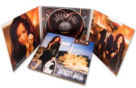
Below are some examples of digipaks. You can see that they usually have 6 panels, 3 on the inside and 3 for the covers.


Research - Digipak's
According to http://en.wikipedia.org/wiki/Digipak, A digipak should typically consist of a gatefold (book-style) paperboard or card stock outer binding, with one or more plastic trays capable of holding a CD or DVD attatched to the inside.
Digipak style packaing is often used for CD sigles or special editions of CD albums. Licensed digipak maufacturers such as Oasis Disc Manufacturing recommend coating the raw printed paper with a protective UV coating, thus ensuring longer life.
Digipak style packaing is often used for CD sigles or special editions of CD albums. Licensed digipak maufacturers such as Oasis Disc Manufacturing recommend coating the raw printed paper with a protective UV coating, thus ensuring longer life.
Editing - A whole day of editing
We were able to edit our piece during the day and also stay late after school in order to get our editing done as quickly as possible so that we could move on to our ancillary tasks. We got all of the editing done in the time that we allocated ourselves and it was relatively stress free!!!
Production - Final, final, final shoot!!!!!
So bad news. We couldn't film on the 25th due to our reservations for the sports hall being over booked. This meant that we couldn't use the sports hall and all other areas of the school was occupied that eveing. However we managed to book the main hall of the boys school for our final shoot the following Wednesday.
On the Wednesday we filmed everything we needed but not without any problems, of course. We booked the hall, however we needed to be packed up for 7. This was fine, we thought we could make it, but somehow we still needed more time!!! We decided that we were being far too picky and just packed up with the shots that we had. We have looked back through the footage and we seem to have everything we need to make our final piece work. So despite the looooooong, problematic and chaotic process of filming, we have managed to achieve what we set out to achieve and hope that everything will come together nicely.
I think we're all just hoping the editing process will less disasterous!!
Monday, 25 March 2013
Production - FINAL shoot
The shoot on Friday 15th March didn't work out due to the fact that I was unexpectedly ill and couldn't come in. We are starting to feel now as though we might have bitten off more than we can chew. However, we are all healthy and in school today so we are going to try and get this last shoot done tonight. We are confident in ourselves today as we have got everything we need and there really shouldn't be anything stopping us from getting this done!
Monday, 11 March 2013
Planning - Our final shoot
At this point, we have filmed everything except for the prom scene. So we have sat down and discussed when we are going to film it. We decided that this Friday (Friday 15th March) would be the best time as this is when everyone is free. Then we will all be finished for next week when we can start to think about editing. Hopefully everything goes well and there are no more problems that will set us back any further.
Planning - Costume
Amy's costume
We decided for the shoot on Wednesday that Amy should wear something bold to show that she is the main focus of attention. We feel this way as she is portraying the way in which the artist feels and is the character that we want most people to focus their attention on. We picked out a bright red coat for Amy as we didn't want her to look abnormal in the surroundings but still wanted her to be the center of attention. The red colour attracts the eyes of the audience, however the fact that it's a coat seems perfectly normal for where she is in the shoot.


We decided for the shoot on Wednesday that Amy should wear something bold to show that she is the main focus of attention. We feel this way as she is portraying the way in which the artist feels and is the character that we want most people to focus their attention on. We picked out a bright red coat for Amy as we didn't want her to look abnormal in the surroundings but still wanted her to be the center of attention. The red colour attracts the eyes of the audience, however the fact that it's a coat seems perfectly normal for where she is in the shoot.

Amy's outfit actually matches this one we found of Zooey Deschanel, who was one of our main fashion insprations for out outfits.

Subscribe to:
Posts (Atom)